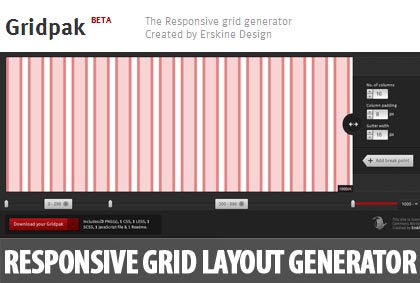
Gridpak is the responsive grid layout generator very quickly, It’s a starting point for your responsive projects, improving your workflow and saving time. Create your responsive grid system once using the simple interface and let Gridpak do the heavy lifting by generating PNGs, CSS and JavaScript.
The width of the grid, number of columns, column padding and gutter width can all be defined which are standard features we have seen from several other layout generators.
It gets better with the ability of adding breakpoints for responsive outputs. You can change the size of the layout, click “Add break point” and there you have it.

Once you have setup the layout, a custom download is ready which includes:
- a CSS file with all the classes and properties you need to create the responsive grid layout
- a LESS file with much the same information but including variables, mixins and methods to help you.
- an SCSS file like the LESS file, but in SCSS.
- a semi transparent PNG image for each grid you have created to help with your design, or with lining things up in your front end.
- a JavaScript snippet that allows you to toggle an overlay of your grid on and off in any browser using the ‘G’ key.