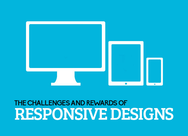
Responsive web design has started to get a lot of attention due to the many benefits that come along with it. Although there are plenty of reasons why you should use responsive design, there are also some challenges that you should be aware of. We are going to cover some reasons why responsive design is good and some challenges that you might run into.
User Friendly Sites
An amazing part about having a responsive web design is that it is very user friendly. If done properly, your users should have a fast and reliable experience with no problems accomplishing what they intended to do. They will be able to easily surf the website, read content, interact with the site, watch videos, and anything else that they want.
Usable on All Devices
A big reason this type of design is popular is due to the fact that everyone has a smart phone now or might use a tablet instead of an actual computer. Since we never know what our audience is going to use, it should be important to make sure that they are able to easily use our sites on any device that they have. A lot of businesses use two different websites, one specifically for phones and tablets, while the other is specifically for computers. There are plenty of reasons why having two separate sites is a bad idea, but with responsive design, there is no need for that anymore.
Good SEO
Google has already expressed that they like responsive designs. With more people having easy access to your site, more people are attracted to it, increasing the overall traffic. As we all know, the more traffic we get the higher authority and rank we get on search engines. Spiders are also able to crawl through responsive designed sites very easily, ensuring that all the content is indexed properly and everything is accounted for.
Load Times
So a big problem that all responsive designers should be aware of is the fact that load times need to be as short as possible. Since people are accessing the site through their phones and other devices, we never know what type of internet they are using. Websites that have large amounts of content on one page might take a user to long to load and will also suck up all their available bandwidth. There are plenty of ways to lower the load times and bandwidth on your site, such as using less images or videos, splitting content pages into multiple little pages, not having to many interactive features, getting a good host, and more. At the end of the design, it is important to make sure each page can be accessed by any internet type in a timely fashion.
Image Display
Unfortunately, images sometimes run into problems with responsive designs. Since these designs are based of percentages and not exact sizes, images might become distorted, pixilated, or otherwise unable to be seen on some devices. There are ways to avoid this from happening, but it you should be aware to take some extra time and make sure each image is viewable on any device. Like I stated earlier, it might be a good idea to cut back on images throughout the whole site due to load times, but also because it might reduce the amount of image errors you will encounter.
More Time To Create
Designers know that responsive designs take more time and effort to create than just normal sites do. This can be a challenge for some because they might want to rush through it to get it finished as fast as possible. The bad thing about rushing through a responsive design is that there are many more risks that you are putting the website in. Making a few mistakes could make the site unavailable on certain devices, lower SEO ranking, decrease the user friendly aspect of the site, and plenty more. So before you start a responsive design, understand that it will take more time and effort, so don’t try and rush it.
There are more challenges and rewards that responsive design offers but there are the main ones. Overall, a properly created responsive web design can increase many aspects of a website.