There are many CSS frameworks that help creating responsive layouts very quickly and easily.
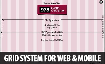
978.gs is a modern grid system for web & mobile design one which is mainly built for rapid prototyping and offers more room compared to the popular 960.gs by widening the gutter space.
The 978 grid system uses 12 columns at 54px, with extra roomy 30px gutters. This comes out to a total of 978px, which uses up most of the space on a 1024×768 monitor. Almost every computer and tablet in the world today is capable of displaying designs built on this grid.

What is a Grid System?
A grid is an underlying structure in which a design is built upon. It consists of rows and columns that are used to align text and images. It allows you, as a designer, to make placement decisions easier and more consistently. Typically, a design based on a grid will have excellent readability and a more professional, organized appearance.
Grid-use has been standard practice in print design for at least a half-century or more. This practice is now being applied to web design. In print design, horizontal rows are emphasized as much as vertical columns. In web design, however, the difficulty in controlling vertical space has led to more emphasis on columns. (978.gs)
You may also like:
The framework is not limited to 978px but there are also different stylesheets for 300px, 748px, 1218px and 1378px grids.
978px grid has more resources: grids in .PSD, .PNG, .SVG, an OmniGraffle template and Photoshop actions.
Besides the CSS files, each size comes with a .PSD file for working with the same grid inside Photoshop.
Compatibility: All Major Browsers
Website: http://978.gs/
Demo: http://978.gs/demo/
Download: https://github.com/brothersroloff/978-Grid-System