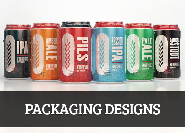
Packaging design and packaging printing both are primary elements to attract customer’s attention. Good quality packaging can get more attraction rather then normal packaging design. When choosing a product, the design of the packaging probably influences your decision far more than you realize. You seen lots of packaging designs earlier, Today’s we are gathered most beautiful and demanding packaging design examples for inspiration.

You might be interested to read:
Lingua Simplex Packaging
Design language pairs games for all ages. Both for adults and for children. Each game pack represents by a character with a typical geographical origin and nationality of their country. Countries which have stereotyped characters, so that each game pack personifies a character for the learning language inside.
Source
Nescafe Alarm Cap Packaging
NESCAFE embraces consumer maker technologies to quickly design and build 200 limited edition, 3D Printed, Arduino-based NESCAFE Alarm Caps.
Source
Kararay Paapar Packaging
The Idea or concept of Kararay Paapar was taken from the street food ‘Paapar’ , Street food is ready-to-eat food or drink, sold in a street or other public place, such as a market or fair, by a hawker or vendor, often from a portable food booth, food cart or food truck.
Source
MUSTANG Jeans Modern Packaging Concept
Source
Monsieur Moustache
Source
Hedgehog Toffee
Source
Chroma Painting Supplies
A conceptual brand of paint supplies, Chroma aims to guide its customers with the right tools for each painting project. The brand’s identity was based on simple illustrations, smooth colors, and effective typography, giving it a contemporary look and feel. The packaging system was set on a brilliant white paper, allowing the identity and colors to be the highlight of each product.
Source
Double 8 Dairy Gelato
The packaging captures this pioneering spirit by creating an unique aesthetic for ultra-premium ice creams and gelatos. Positioned to stand out amongst other products in the high-end specialty food retailer, the design solution uses only color and repetitive typographic elements to create a bold and sophisticated branding statement.
Source
Demitasse Cafe & Creamery
Source
Midnight Moon Artist Box
Recipients opened a wooden, screen printed box, inspired by old moonshiner crates, to find a card welcoming them to enjoy the Midnight Moon experience. Musicians were then greeted with an overview and history of the brand, along with cocktail recipes and “The Great Boredom Bust” activity book, designed to share details about the product and keep them entertained.
Source
Semtex Cactus
Source
High Tea with Harriet
A fun project for a newly established tea company based in Melbourne, Australia. I let loose on the branding and packaging design for their company and new range of teas.
Source
VitaPack
VitaPack is convenient to carry 0,5 kg orange in hand. Thanks to the round-cuts on the two side of the packaging (made from paper) we could see the fruits which we could take out easily. The packaging could be ductile from square shape into lengthy shape if we tear it up along the perforation – so we could carry it simply if we have more things in our hands.
Source
Nescafe Travel (Concept)
Source
It Pops
The goal was to communicate the tradition and the natural ingredients used for in the popsicles; this is the reason why we chose to combine handmade typography with the popsicle image. Here you can see the first three flavours but It Pops will be launching new flavours soon.
Source
Ford Jekson (Concept)
Ford Jekson. The product which offers a second life as a toy. Drink & play.
Source
Mokaya Chocolates
The hand-drawn illustrations on the packaging take a humorous look at everyday situations, made better, with a little bit of chocolate.
Source
NibMor Packaging
Pearlfisher New York revitalizes NibMor, a new challenger chocolate brand. Pearlfisher New York has created the new brand strategy, tone of voice, brand identity, and packaging for organic chocolate brand, NibMor.
Source
Alyssa Phillips Concept
The assignment to package a found object inside of a related object. I chose to package earbuds inside of a cassette tape, giving the now rarely used cassette a fun new purpose
Source
Reitan Packaging Design
More and more we choose a quick sandwich, wrap or salad for lunch. But if you are in a hurry, it can be difficult to see what is hidden in the packaging and tricky to find what you are looking for. Is the food fresh? Is it healthy? With new packaging 7-Eleven and Pressbyrån in Sweden want to enhance their fast food range.
Source
RuTT Beer Brewery
RuTT Beer Brewery is a small company from the Tampa Bay Area born with a passion for craft beers. We produce Gluten Free specialty beers rich in flavor, aroma and personality.
Source
BATL
The key idea was to make an accent on bright and clear design. There is an individual and coupled with metal colour for each product type. A glowing X in each flavor type design catches an eye and differentiates the product from others. Everything is clear and not posh – see the goal – achieve the goal. This decision made the BATL easy for understanding, whereas it still remains modern and stylish.
Source
Double U Coffee
We made a brand name «DOUBLE U COFFEE» from a simple insight: sometimes you want to double yourself up to be in two places at the time, to have a few idle hands, to do things two times more an two times faster and live for yourself two times longer. Seems like kind of magic. But isn’t coffee itself simply gives us that feeling of helpful magic? Simple Hot Magic.
Source