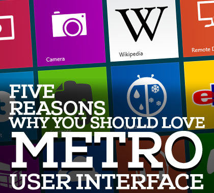
There is no person passionate about design that doesn’t know the latest style adopted by Microsoft. The name of this style is still disputed, but it’s not quite important if we call it Metro, Microsoft UI style or Modern. Due to the success of Apple products, the designers were highly influenced by the skeuomorphic approach and somehow people became bored with this idea. The designers of Microsoft quite probably were aware about this fact and came with a new solution, Metro style that has many pillars that are completely opposed to the skeuomorphism promoted by Apple.

I am very disappointed by the designers that instantly criticized the skeomorphism and publicly praised the new Microsoft idea. Metro and skeuomorphic are two styles that are very different but it doesn’t mean that one is beautiful and one is graceless. I am not the advocate of any of these but it’s in vain to say that skeoumorphic design is dead. The designers are using too often skeumorphic items and the users simply became bored with…but it doesn’t mean that skeuomorphism is annoying.
On the other hand, the new style adopted by Microsoft is really awesome and the entire design community should have a closer eye on this. I guess that some of you are not sure about the advantages and disadvantages of Metro style. Accordingly, I allow myself to present here five major reasons why you should be interested and, why not, fell in love with the style.
1. Content before chrome
Three years ago, when I started writing guest posts there was a great debate about which one is more important : content or design. I think that it was the end because lately this debate was totally in-existent; I think that is was a mistake not to continue the ideas exchange but there were other issues to debate. Together with the reinvention of Metro, it seems that the old dilemma received a new role. Anyone working for Microsoft or simply interested in this approach will praise his or her new motto: “Content before chrome.” Metro isn’t minimalistic but it has the great advantage that is simple, usable and doesn’t disturb the user…content before chrome. The idea is obvious: Microsoft wants people to return to the original roots of Internet: the information and not just a brunch of wonderful but useless icons.
2. The typography is regaining its role
Another much-appreciated feature of this new style is the bringing back of the typography in the main scene. Once again the colorful icons and buttons were ignored and replaced by boxes (no gradients, no shadows, no effects, just bright colors) that let the content speaks for itself. Personally, I consider this idea wonderful and it shouldn’t be ever abandoned.
It’s unfair, but legal to try manipulating the eyes of the viewers and this fact was very used by designers. A cool design that manages to manipulate the users may hide a poor content. Somehow, a design with shiny elements attracts people even if they don’t have any clue about the content…in fact what they wanted. In this way, the Internet is definitely more appealing and colorful but it’s what we wanted?
I don’t think so and Metro let the words speak for themselves…once again “content before chrome”. Yep, the designers should go back to typography and learn to seduce people with interesting and useful information. Definitely, no information will be appreciated if the fonts used are boring or unreadable. The design is just to offer a better context…
3. Mobile user friendly
Since 2010 the designers agreed that mobile browsing can’t be ignored and started developing strategies to create mobile friendly websites. Nowadays we have responsive design that encapsulates all the ideas and techniques to build a website that may be perfectly rendered no matter by the gadget used (tablet, smartphone, smart TV etc). Fortunately, Metro style is very versatile and it’s the perfect solution for responsive websites.
Its simplicity and the bold boxes are the perfect features for a style that doesn’t ignore the context of mobile browsing. Much more, it is a pleasure even for desktop navigation; therefore everyone should pay attention to it.
4. Fluid and flexible
Another impressive feature of Metro style is its fluidity and flexibility; these two are vital in realizing a responsive online presence. Someone said that Metro isn’t simple, is just unsophisticated and personally, I think it is the main idea behind this approach. The lack of sophisticated items allows to anyone embracing Metro style having a bigger flexibility in everything he is doing and once again, it is awesome. Simple for designers to create, simple for users to enjoy but in the same time very effective…isn’t it the feature of good design?
5. Motion is never ignored
It’s possible to consider Metro style being boring and lacking any items to relax the mind and eyes of the user. It’s another myth that is easily put down. The best evidence is the nice and eye-catching slides. It’s true that Microsoft Surface, the tablet released by them is the perfect context for the types of motion proposed, but everywhere on the web may be successfully implemented.
I think that all the above reasons convinced you to pay closer attention to Metro style and why not, to create some wonderful websites under its influences. If you already created some, don’t be shy, add it in the comment area, and share with us your experience. We are waiting for your contribution!