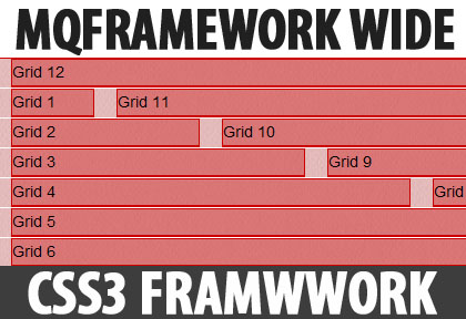
A responsive CSS framework, MQFramework utilises the @media property to allow you to design your sites for browsers of all sizes. MQFramework degrades perfectly down to mobile screen sizes.
The framework is based on a 12 column-grid and includes a typography stylesheet to handle the basics and a CSS reset.
It is simply a core for building responsive websites which you usually wouldn’t need to change any part of but add your own styles on top of it.

Screen Sizes
MQFramework is designed for five different screen resolutions. But with that comes the challenge of displaying the information you require.
The Grid
MQFramework is built and designed around a 12 column grid. For each of the supported screen sizes MQFramework has adopted a different width of container to house the grid. As for mobile versions, the twelve columns become one stacking up vertically.
Typography
Included is a basic typography stylesheet for your needs, but don’t fret, you can use your favourite @font-face fonts and change all the styles to suit your project.
MQFramework is a very easy to implement and there are 2 versions provided to choose from: fluid + fixed.
Compatibility: All Modern Browsers
Website: http://mqframework.com/
Download: https://github.com/edgeui/MQFramework