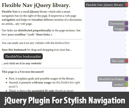
Flexible Nav is a jQuery plugin that can add stylish navigation bar on the right of the page. It improves a web page navigation and helps to visualize different sections of a document, an article and any web page.
It analyzes the heading tags of the page and displays them on the right side of the page as links by proportionally keeping the distances between each item.
Each link gets users to the related items and, as the user scrolls, the navigation keeps showing “on which part of the page you are”.

Generation and Flexibility
The library can generate for you the nav sidebar content providing elements to display in navigation.
By default, it uses h1 to h3 elements to retrieve and locate the different sections of a document but you can override these elements selector.
You have usually two kind of selected elements to use:
- Select a title. The link will take the title as text.
- Select any container and add a
data-navtext attribute to define the title you want.
Example: <div id="demo" data-navtext="Demo of the game">...
Using this code bellow, all nodes having this navtitle class will appear in the flexible nav panel.
Flexibility only
You can also create your own nav links to have more controls of used links. Conventionnally, you need to use a <nav /> element with a flexible-nav class and <a href="#myidtarget" /> kind of elements for links.
(replace myNav by you nav id)
The plugin is specially handy for web pages that are updated frequently in a given structure as there will be no need to update the navigation each time.
Requirements: jQuery
Compatibility: All Major Browsers
Website: http://demo.greweb.fr/flexible-nav/
Download: https://github.com/gre/flexible-nav