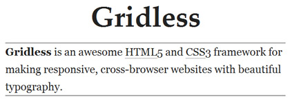
Gridless is a boilerplate for creating responsive and cross-browser/platform websites with beautiful typography. Gridless has a simple approach on markup and styles. There aren’t any pre-made grid systems and the CSS isn’t littered with silly classes. Gridless is only a starting point, that should be edited to suit each project’s needs.
It doesn’t come with any grid systems, rather, the focus is on progressive enhancement and being a starting point for any project (which you can add a grid system later).

The framework has rules for CSS normalization (no CSS resets), print styles for optimized performance, an optimal caching and a well-organized folder structure that you may feel comfortable with.
Gridless works on all major browsers including IE6.
Features:
- Responsive (responds to the user’s device screen width with the adequated CSS)
- Progressive enhancement and mobile first
- Cross-browser compatible (even IE6 and 7)
- CSS normalization instead of CSS reset
- Beautiful typography with a vertical rhythm
- Print styles optimized for performance
- Optimal caching
- HTML5 and CSS3 ready
- Safe CSS hacks instead of conditional classnames/stylesheets
- Micro clearfix hack
- A well-organized folder structure
Compatibility: All Major Browsers
Website: http://thatcoolguy.github.com/gridless-boilerplate/
Demo: http://thatcoolguy.github.com/gridless-boilerplate/demo/demo.html